Last week Technical Rex launched its latest project: Giving Jar. Right now the landing page for Giving Jar looks pretty basic: some markety text, a pretty picture, and a place to sign up for a newsletter. There’s more than meets the eye on that page, though, and creating it was quite the expedition.
Many discoveries were made, there were several pitfalls, and good notes were taken so a map could be made. I share this map with you now so that you don’t have to repeat the voyage without a guide.
What is a Landing Page?
A landing page is web page that is typically arrived upon by clicking an advertisement, Internet search result, or other marketing campaign link. Its purpose is to promote a product or service in such a mind-blowing way that any visitor who so much as looks at the page will have no choice but to sign up to be the next early adopter, fanboy (or fangirl), or… sales lead.
In other words, a landing page gets people excited about something new on the Internet.
The landing page I created for Giving Jar announced that a new service is being built and anyone interested could sign up for a newsletter to get charity interviews and updates about how Giving Jar is coming along.
On a Desktop Computer
Here’s a screenshot of the whole Giving Jar landing page. The labels identify the important bits, and you can read more about each one in the list below the image.
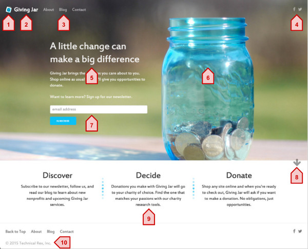
1. Logo
An easy-to-recognize symbol to represent your product or service. An SVG logo is easy to scale to any surface and transform in all sorts of creative ways.
2. Name
The name of your product or service. Make it the first item in the navigation bar up top, next to the logo, so visitors see it first and can find their way home if they wander away.
3. Navigation Bar
Link to an About page where visitors can read more details about the business. The Contact can link to an email address or contact form, but it should offer a way for visitors to ask questions. A Blog is an easy way to provide regular updates to visitors who don’t want to sign up for anything right away.
4. Social Links
Use social media to promote your product and business. Make sure they’re always visible. Use icons instead of words to make them easier to recognize (and take up less space). Font Awesome has a great collection of such icons.
5. Headline/Tagline
Make a good first impression by placing a catchy phrase and brief description of the product or service front and center on your landing page. If this tag line isn’t great then a visitor probably won’t bother reading any further into your page.
6. Attractive Imagery
Use a beautiful image or video to help visitors relate to the product or service you are offering. It should stir a positive emotion of some kind and keep people focused on your page.
7. Call to Action
This button or small form should be clearly visible on the page and minimize the barrier required for a visitor to act. The last words before the call to action should be a small reminder of what they are getting in return for providing an email address or phone number.
8. Visual Cues
The landing page should look complete without scrolling. Use as much of the vertical space as possible and offer visual cues anywhere that the visitor needs to do something to see more. The arrow on the Giving Jar page is gently bouncing to indicate that there is more below the main image. A visitor can click it or scroll to see more.
9. Brief Description
Briefly describe (readable in 30 seconds) the key features or values of your product or service. Expand on the headline and break up each point them easier to consume. Add a splash of color so it doesn’t look like a wall of text.
10. Footer
Include navigation and social media links, but don’t make them stand out as much as the navigation bar at the top of the page. This is also where the copyright, links to businesses behind the product, Terms of Service, Privacy Policy, and Press Kit typically go.
On a Small Screen
The landing page for a mobile phone will look much different. Besides the obvious decrease in screen size, you will now have much less horizontal real estate than vertical. Fortunately, CSS media queries and some minor adjustments to your HTML can make your landing page beautiful again.
If you designed your landing page mobile-first then you will probably still need to make some adjustments, but instead of thinking about how to trim back, you can think of how to expand and add content.
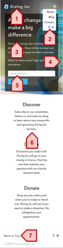
1. Logo and Name
The logo and product/service name may be all that fits width-wise on a small screen. Be prepared to toss the rest of your navigation links.
2. Collapsible Menu
A hamburger icon is generally understood as an interactive, collapsible menu. Any navigation and social media links that didn’t fit in the navigation bar can be placed in here, but don’t make the menu too tall.
3. Visible Content
You may have to adjust some styles to make the headline and other text easier to read. Consider changing font colors or putting a translucent background behind the content to keep the content standing out like it should.
4. Smaller Imagery
Smaller devices can often mean smaller bandwidth. Create a smaller resolution version of the background image to use on smaller screens so the page still loads quickly.
5. Friendly Forms
Use HTML 5 input types such as “email” and “tel” to provide a more convenient keyboard that visitors can use to quickly enter the information you are requesting.
6. Vertical Description
If you broke your product/service description up into small pieces as suggested in #9 above, this part will be easy. Make the blocks wrap on small screens and they will automatically arrange themselves vertically. You can get rid of horizontal separators in this case, too.
7. Minimal Footer
The footer will have the same limitations as the top navigation bar because of the width of the screen. A collapsible menu at the bottom of the page is weird, so get rid of all unnecessary items that are already available in the menu up top.
Link Destinations
A visitor’s whole experience at your landing page should be great. Not only does the landing page have to look amazing, all of the pages that you link to from the landing page need to look good, too. Fortunately, you can reuse many of the visual assets used to create your landing page.
Here are some quick tips for polishing the pages your visitor might wind up at.
Social Media Sites like Facebook and Twitter
Your logo is a symbol that people see and immediately associate with your business, so use that as your profile photo on social media sites.
An easy way to create a banner image is to crop or scale the background image from your landing page. Each social media site’s banner uses different dimensions and many blog articles tell you out-of-date dimensions. Go to the social media site and use your browser’s developer tools to inspect the banner and get the current dimensions.
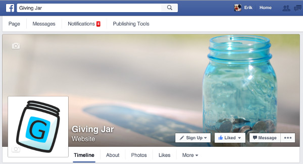
Use a variation of your headline/tagline in your profile description and link to your landing page from each social media site.
Finally, post to your social media accounts regularly! If someone finds their way to your Twitter page and it’s a barren wasteland or hasn’t been used in months you will immediately lose credibility. It’s easy to use Buffer and Google Alerts to queue up a steady stream of news related to your line of business.
About Page
If wants to know more about your product than what the landing page provides, the About page will likely be their next destination. Provide a description of the product or service that can be read in a couple of minutes (about 200 words).
Since there is a noticeable increase in the amount of text on this page, you may want to eliminate other distractions on the page such as images and links.
Blog
Offering a blog with regular written content is a cheap and easy way to offer product updates and what your business has learned recently. Feeling informed and learning about the challenges you face are two things early adopters and fans love!

Regardless of which blogging platform you choose, there are bound to be lots and lots of amazing looking themes. Pick a theme with a clean, professional look, minimalist color scheme, and elegant typography. Make sure the theme looks good on a mobile phone and can link to your social media accounts. People love to read and get lost in social media before bed.
Like social media pages, make sure you are posting to the blog regularly. Blogs contain longer content, so there’s an expectation that it won’t be updated as frequently. Shoot for once a month to start.
Behind the Scenes
Visually, your landing page should be in good shape. Functionally, that’s a different story.
Your landing page should be easy to share. Analytics will be invaluable for discovering how many visitors view your page versus how many complete the call to action. Oh, and that call to action needs to do something. And lastly, you need a domain and server where the page can be hosted!
Pretty Page Previews
When you or anyone else shares a link to the landing page, you can make a little preview of it appear in most social media sites. Do this by adding meta tags to the head element of every HTML file you expect people to share.
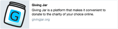
Here’s what Giving Jar’s meta tag set looks like:
1
2
3
4
5
6
7
8
9
10
11
12
13
14
15
16
17
18
19
20
21
22
<head>
<meta charset="utf-8">
<meta name="description" content="Giving Jar is a platform that makes it convenient to donate to the charity of your choice online.">
<meta name="viewport" content="width=device-width, initial-scale=1">
<meta property="og:type" content="article" />
<meta property="og:title" content="Giving Jar" />
<meta property="og:url" content="http://givingjar.org" />
<meta property="og:description" content="Giving Jar is a platform that makes it convenient to donate to the charity of your choice online." />
<meta property="article:published_time" content="2015-11-16T00:00:00-00:00" />
<meta property="article:modified_time" content="2015-11-16T00:00:00-00:00" />
<meta property="og:site_name" content="Giving Jar" />
<meta property="og:locale" content="en_US" />
<meta property="og:image" content="http://givingjar.org/images/giving-jar-icon-196.png" />
<meta name="twitter:card" content="summary" />
<meta name="twitter:site" content="@givingjar" />
<meta name="twitter:creator" content="@givingjar" />
<!-- Rest of head goes here. -->
</head>
These tags will make Facebook, Twitter, Google Plus, and a handful of other social media sites show a little preview of your site when a link is shared. You can control the image, title, and text by adjusting the og:image, og:title, and og:description content, respectively.
Analyze This!
These days, capturing site traffic data is pretty easy. I use Google Analytics to analyze landing page traffic because it’s free, easy enough, and I already had a Google account. Feel free to try something else, though. Most of them work very similarly.
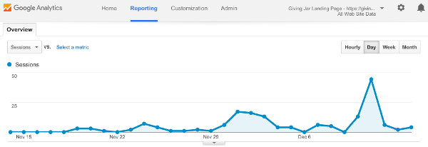
The first step will be to create a new tracker in whichever tool you use. When you create the tracker, usually you are provided a snippet of JavaScript that you can embed on all of your HTML pages. Once you do that, go back to the tracker’s dashboard and start watching people pour into your site!
Make the Call to Action Work
If you don’t have a server to capture form input then you will need to use some other service to capture visitor sign-ups for you.
Giving Jar’s call to action is a newsletter that visitors can subscribe to. Mail Chimp offers free mailing lists and a way to allow anyone who’s not a robot to subscribe. Toss in a jQuery plugin that keeps the visitor on the landing page instead of bouncing them over to a Mail Chimp website, and you’ve got yourself a nice mailing list signup experience!
If you don’t need a newsletter, but you still want to collect a little bit of info about a visitor, there are services to do that for you (and for free). Try Google Forms, Survey Monkey, or Wufoo (an offshoot of Survey Monkey).
Serve It Up
The last few steps involve hosting your landing page on the Internet somewhere.
There are a few free static site hosts. I’m a big fan of GitHub Pages and Surge. GitHub Pages operates off of a version-controlled repository and requires using Git, which isn’t beginner-friendly but is an invaluable system for managing your site. Surge lets you upload a directory from your computer in one command. It’s very easy to use. Both let you use a custom domain name. Of course, feel free to try something else if you’re the adventurous type.
If you purchased a domain name, go to the dashboard where you can update your DNS settings and add the appropriate A and CNAME records to point at the server that hosts your files. Both GitHub Pages and Surge offer detailed instructions for how to do this. After you make the DNS changes, you may have to wait a day for your site to be available on your domain.
You may want to consider setting up email accounts on your domain name, too. This step is optional, but it adds a little bit of legitimacy to your site if someone sends an email to “you@yourdomain.com” instead of “yourdomain@gmail.com”. Zoho offers free email services on your own domain for a limited number of users. Beyond that you should consider Google Apps. It’s not free, but for about $4 per month per email account, it’s pretty reasonably priced.
You Made It!
I’m proud of you for reading this whole article, it wasn’t short! Give yourself a high five.
In all seriousness, though, I trudged through figuring out all of these little pieces that make up a landing page and had to share it all. I knew it was a lot of information, but it also would have been great knowing that there’s a lot more to a landing page than a dash of HTML and CSS.
Of course, if your eyes are bulging out of your head because of the amount of work involved with making your own landing page, there’s always Squarespace. :)